

Choosing a brochure fold
The fold you choose changes how a brochure is read, carried and kept. This guide compares common brochure folds in practical terms so you can match the format to your content before artwork goes to print.
Start with the way the brochure will be read
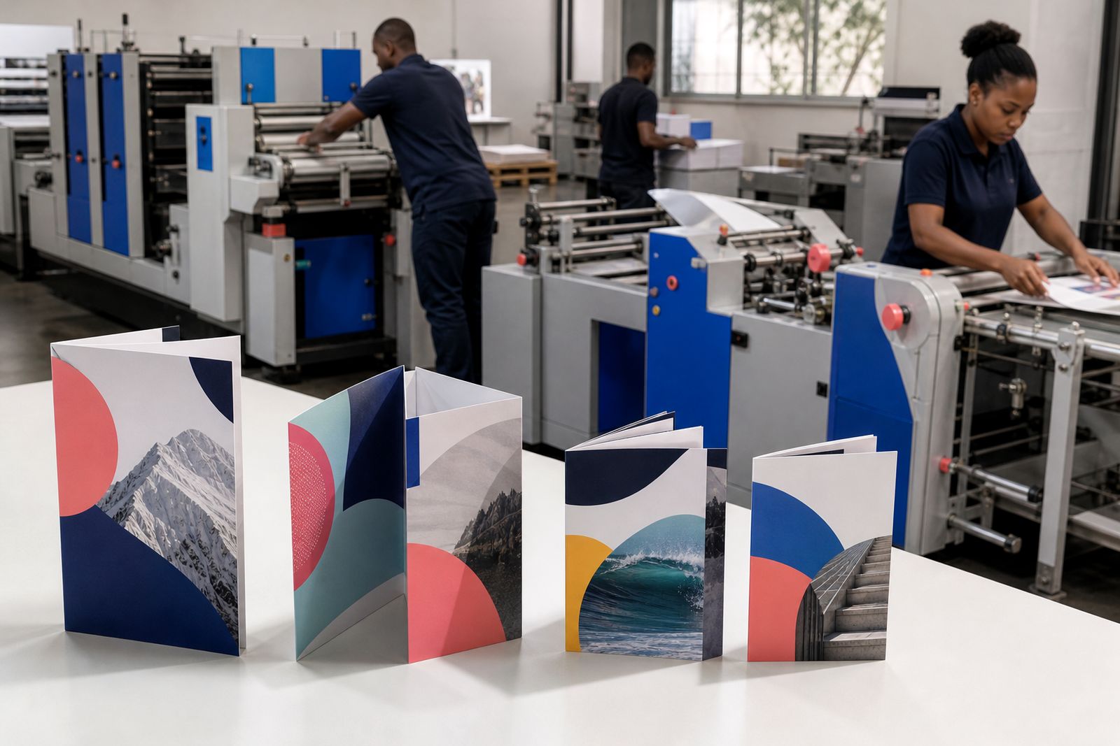
Brochure folds are not only about appearance. They control reading order, panel size, how headings land, and whether one message is revealed all at once or in stages. A fold that works well for a menu, price guide or school prospectus can feel awkward for a product launch handout or event insert.
Before settling on a format, think about where the brochure will be handed out and what the reader must understand first. A receptionist pack, church notice leaflet and showroom handout all behave differently once they are folded, opened and passed around. If the first panel has too much copy, the piece can feel crowded before the inside spread is even seen.
- Choose a fold around reading sequence, not only panel count.
- Decide what the front cover must do in one glance.
- Group content into short sections before you build artwork.
- Allow space for images, margins and fold tolerances.
- Check whether the brochure will sit in a holder, envelope or presentation pack.
Bi-fold: clean panels and a straightforward opening
A bi-fold brochure is folded once, creating four panels. It suits content that needs a clear front cover, a full inside spread and a simple back panel for contact details or a closing message. For many businesses this is the easiest fold to plan because the reading path is familiar and each panel has decent room for copy and images.
Bi-folds work well for company overviews, service summaries, school information packs and product sheets with a small range. The inside spread can be used as one large visual area or divided into two balanced pages. That makes it useful when you want one strong image alongside supporting text, or a comparison table that should not be broken across several narrow panels.
Where bi-folds can fall short is when there are many small topics to separate. If your content naturally breaks into several bite-sized sections, a single fold may leave the inside feeling a bit too open unless the layout is handled carefully.
Tri-fold and Z-fold: more panels, tighter planning
Tri-fold and Z-fold brochures both create six panels, but they open differently. A tri-fold folds inward so one end panel tucks inside. A Z-fold opens in a concertina pattern with panels flowing from one to the next. That difference matters when you plan headlines, maps, steps or product groups.
Tri-folds are common for service menus, tourism handouts, programme summaries and campaign leaflets. They are compact and easy to carry, but each panel is narrower than a bi-fold panel. Copy needs to be shorter, headings need to work harder and images need careful cropping. The tucked-in panel also has to be slightly narrower for the fold to sit properly, so exact panel planning matters.
Z-folds are useful when the reader benefits from a left-to-right sequence that keeps unfolding. They suit timelines, process explanations, routes, menu sections and product ranges that should feel linked. If one long illustration or diagram needs to move across panels, a Z-fold often handles that better than a tri-fold.
- Use a tri-fold when you want a cover panel and a reveal inside.
- Use a Z-fold when the message should flow panel by panel.
- Keep body copy shorter than you would on a bi-fold.
- Do not place fine rules or small type directly on fold lines.
- Remember that the inside fold panel on a tri-fold must be narrower.
Gate fold: strong reveal for premium launches and highlights
A gate fold has two outer panels that open toward the centre, revealing a larger inside panel arrangement. It is chosen less often than a bi-fold or tri-fold, but when the content suits it the format has real presence. The closed brochure feels controlled and formal, then opens to a central reveal that can carry a hero image, a product feature or an event announcement.
This fold is often a good match for invitations, premium product brochures, selected property material and launch pieces where the opening action should create pause. It can also work for school or organisational packs where a key message needs to sit behind the opening panels.
The trade-off is usable panel space. Gate folds need disciplined planning because the opening leaves and centre panels each have a distinct role. Trying to force too many paragraphs into a gate fold usually leads to cramped columns and weak hierarchy, and thats where a bi-fold or booklet might have been the better call.
A practical checklist before artwork is supplied
Most fold problems start before print, not on press. The content is often written in one long document, then squeezed into panels as an afterthought. A better route is to map the brochure as separate panels from the start, including front cover, opening panels, inside sequence and back panel.
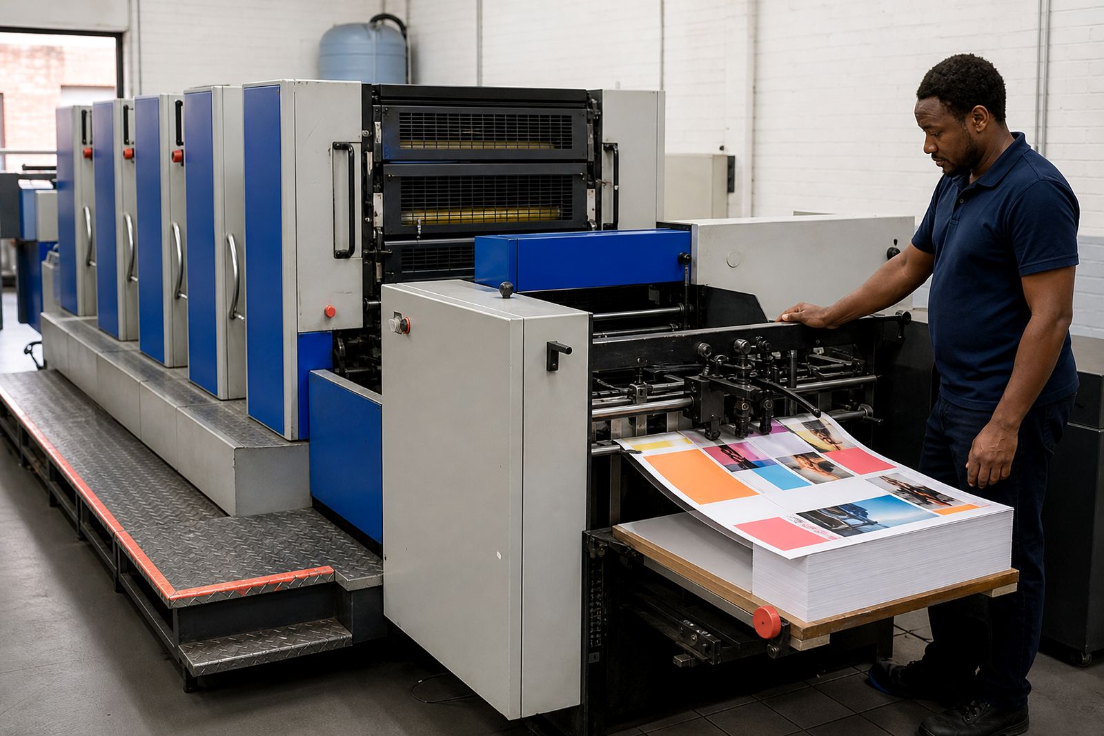
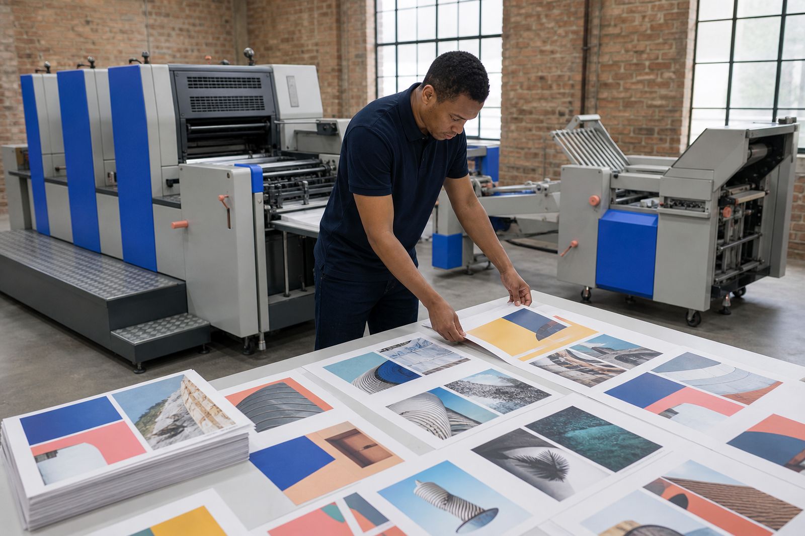
For sheet-fed offset printing, folds also need sensible margins and image placement. Heavy coverage across a fold can mark if not planned well, and small type too close to the fold can become awkward to read. Proofing is the point where these details should be checked carefully.
- Print a dummy at actual size and fold it by hand.
- Number panels in reading order before final layout is approved.
- Check panel widths for tri-fold and gate fold jobs.
- Keep logos, page numbers and contact details away from folds and trims.
- Review whether images run across folds cleanly.
- Confirm the finishing method suits the stock and intended use.
When a brochure should become a booklet or catalogue
If the brochure needs too many exceptions, it may not need a different fold. It may need a different format. Once content grows into multiple service categories, product families, schedules or detailed specifications, folding alone cannot solve the layout problem. At that point a saddle stitched booklet or a perfect bound catalogue can present the information more comfortably.
A folded brochure works best when the message can be broken into a small number of clear sections. If every panel feels overloaded during planning, that is a warning sign. The piece may still print neatly, but the reader will work harder than necessary. For campaigns, handouts and concise product information, folds are often ideal. For longer reading, structured page counts usually do the job better.
If you already know you need a bi-fold or gate fold format, see our pages on bi-fold and gate fold brochures. If your content is better suited to six narrower panels, our tri-fold brochures page is the next useful stop. For larger printed ranges, catalogue printing and booklets can carry more detail without forcing everything into a fold.
What our Brochure Printing customers say
Verified Google reviews
Questions we get asked
Which brochure fold is best for a service overview?
A bi-fold is often the easiest starting point for a service overview because it gives you a clear cover, a roomy inside spread and a simple back panel. If the service list is longer and breaks into several short categories, a tri-fold may fit the content better.
Is a tri-fold the same as a Z-fold?
No. Both usually create six panels, but they open differently. A tri-fold has one panel folded inward, while a Z-fold opens in a concertina pattern. That changes panel widths, reading order and how artwork should be arranged.
Can one image run across folded panels?
Yes, but it needs care. Large images can cross panels on bi-fold, Z-fold and some gate fold layouts, though fold lines and panel movement must be considered. Fine detail, faces and small text should generally stay clear of the fold area.
Tell us about the job
Send sizes, materials and where you are through our contact form, and we will come back with the practical options.
Open the contact form